

The Problem
In Q2 of 2016 the company was on an unsustainable trajectory supporting two aging platforms – one that offers parental controls and another that lets parents locate their family. Both were stagnant, faced increasingly robust competition, and were at risk of losing lucrative deals with our carrier partners.
The design team was asked to come up with a combined and revamped product of the future. Verizon Smart Family was a chance to breathe new life into our products with original research, improved design thinking, new features and a modernized and dynamic UI to win renewed carrier contracts and build the app for families.
Summary
Verizon Smart Family gives 1.7million parents the superpowers they need to feel confident raising children in the modern world. With Smart Family, parents feel safer knowing they can locate their kids anytime, get insights into their device usage, and block inappropriate apps and websites.
Goals
Business
Win over our carrier partners with an enticing future vision for the product.
Maintain and grow the user base with new value in the product.
Improve retention & LTV
User (design)
Build the thing for families ("one app for every family").
Supporting & assisting parents in their goals.
Keep their kids safe – physically and digitally
Help their kids grow into successful adults - achieving the balance between self-sufficiency and oversight/control.
Feel like they’re being good parents – Help parents understand usage in context of our dataset of kids at large.
Role
Designer facilitating a 45 person cross functional team performing –needfinding, IA, wireframing, UI, prototyping, usability, copywriting, product roadmap prioritization with PMs, and some visual design.
Users are the experts in what to build
The design team interviewed 15+ parents and distilled parents most important concerns.
Inappropriate content (quality) - Initially about limiting exposure, then turns into targeting specific concerns.
Screen time (quantity) - Healthy amount of screen time - to teach them balance at an early age.
Location - Grows to be important as kids gains independence. Walking home from school, staying over at a friends, driving, etc.
Design principles solidify the right user & engagement model
Through research synthesis we created design principles to guide our product thinking.
Deliver proactive value - Parents are busy, we do the work for them when there is something important to tell them. Pushing insights not data (which is common in other apps).
Be action oriented - Keep parents engaged and allow them to take action when issues come up so they know they are being good parents.
Evolve with the family - Families aren’t static, solutions can’t be either
Parenting techniques evolve as kid grows up - time spent together, awareness, ownership change. Using the Avast Mobile Inteligence lab, glean insights and help the app adapt to the families needs year after year.
Require minimal behavior change - Parents are busy, we want to fit into the natural flow of what they are already doing (just make it easier on them). The behavior of the parent trains our app, not the other way around.
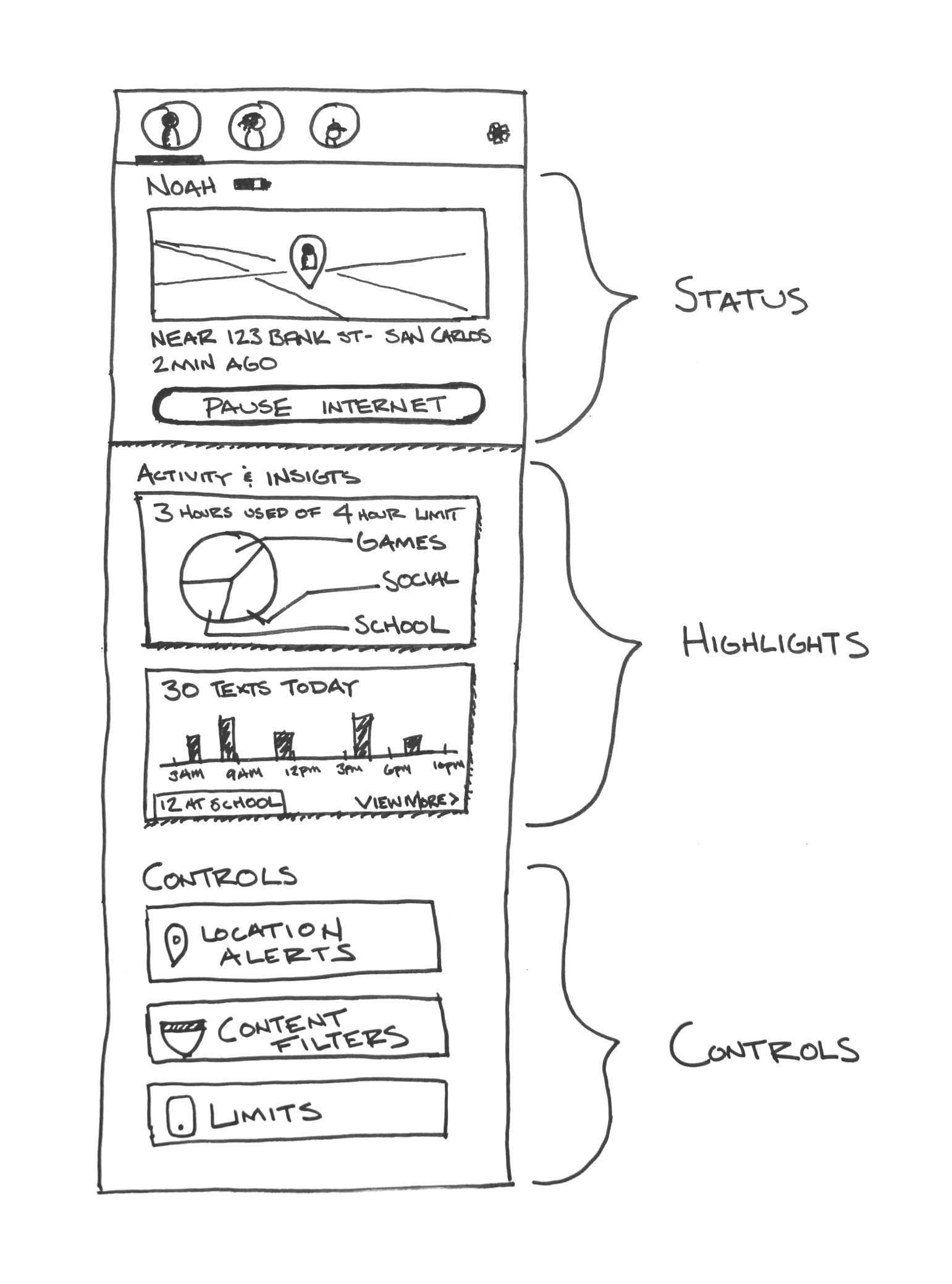
Building a UI for active and passive engagement
Status (for whats most important)- we wanted to use the most valuable real estate to be dynamic and offer value everytime a parent came to 'snack' on the app. This includes immediate answers to questions about location and allows parents to take immediate action by pausing internet during meal times, or when their child needs a break.
Highlights (for "snacking" behaviors) – the "insights cards", gleaned from our mobile intelligence lab sorting through troves of data, the feature I am most excited about in the app. With insights we dynamically show a new card every few times a parent come into the app about their kids usage, how it compares to the population, or as a mode of passive onboarding to tell them about more features in the app they can take advantage of.
Controls (for the "set it and trust it")– in contrast to the dynamic information above, we kept the more set it and forget it features at the bottom of the screen (like content filtering, geofences, and controls child phone usage) and use different onboarding techniques to help the user get the most out of the product.
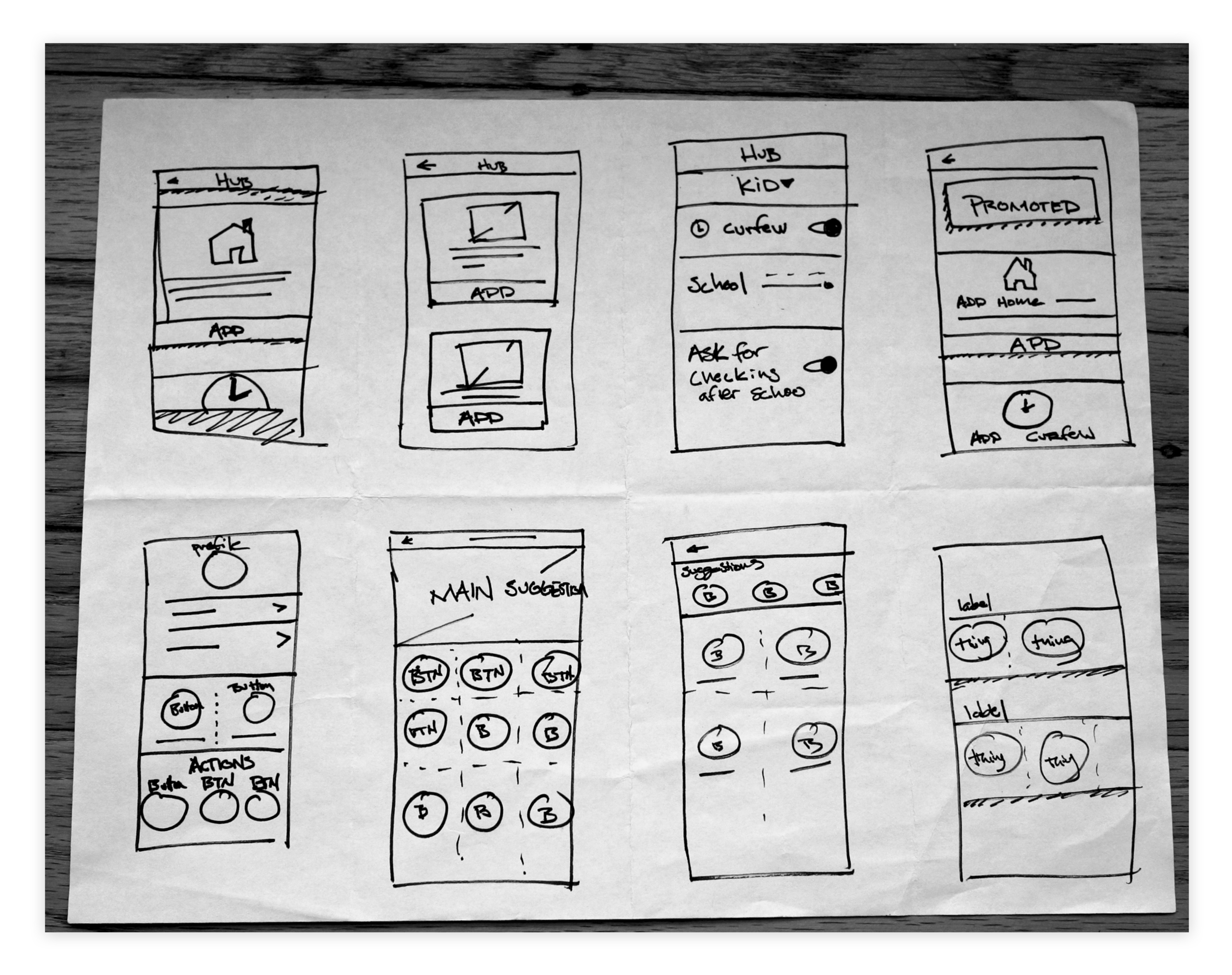
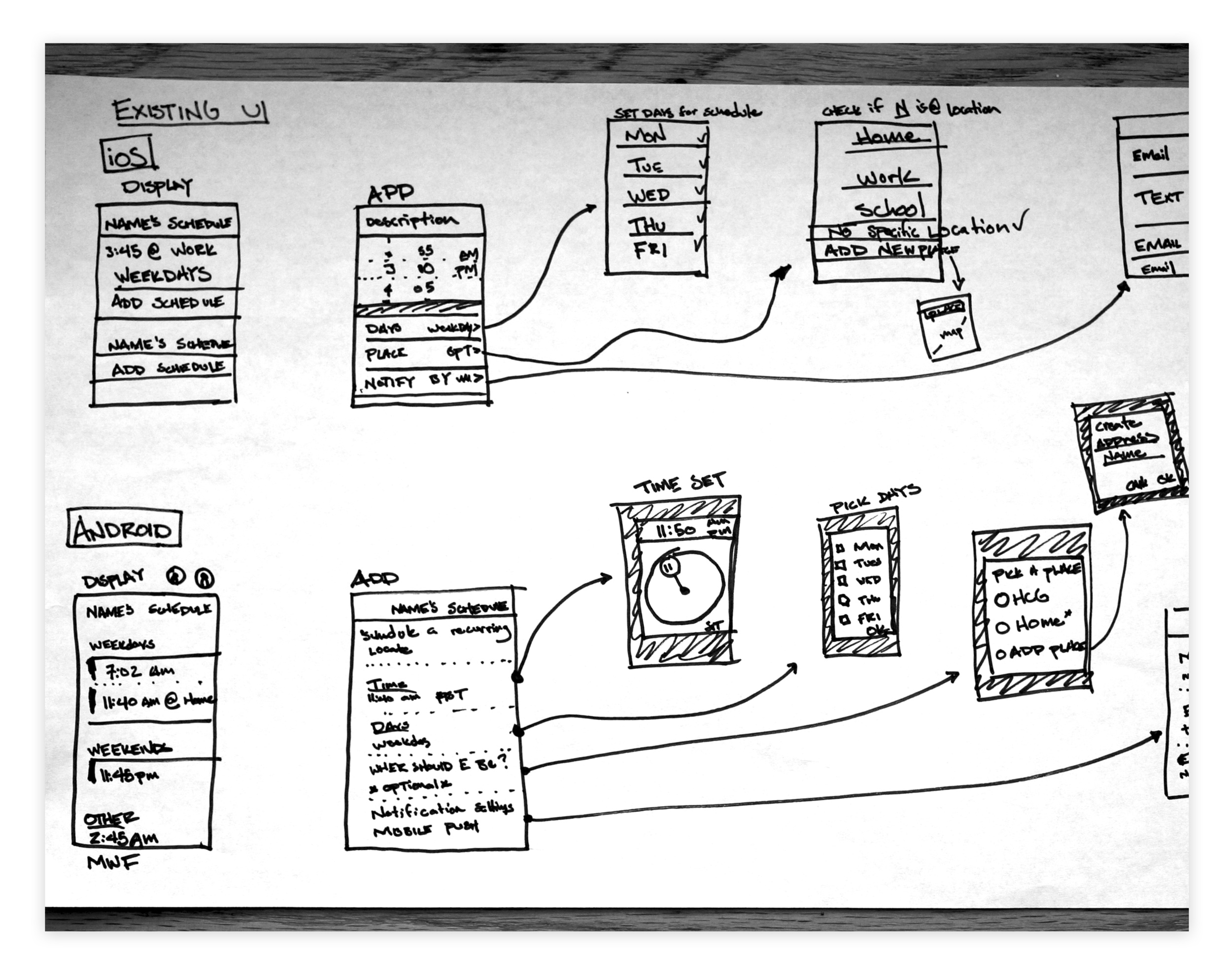
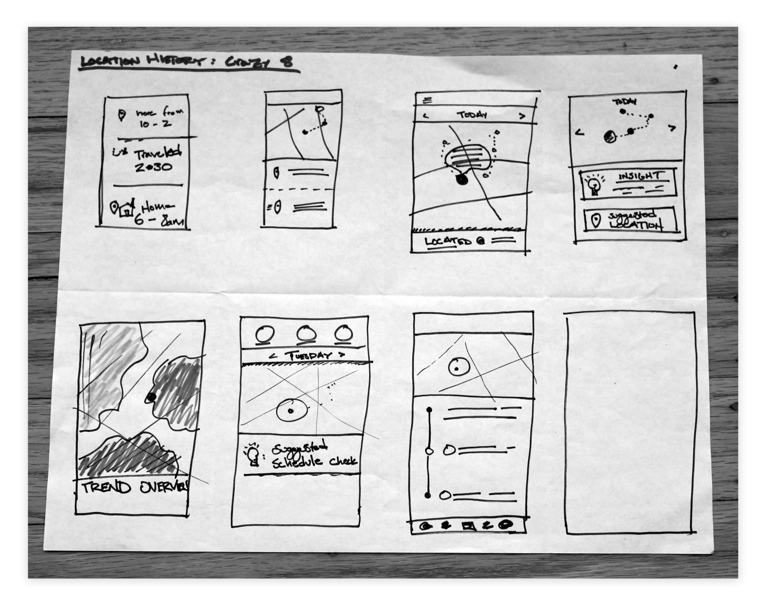
Prototyping for usability, communication and UI
Usability testing – We did multiple sessions from hand drawn sketches to high fidelity prototypes (right) to tease out issues in our UI.
Communication – After every testing session we'd ask people to describe the app to a friend as a proxy for if they understood the value they'd get from it. We were very pleased with the results here.
UI for older users – Because our users are generally over 40, legibility and navigation are always big concerns to test multiple times. Through a couple of iterations we were able to find the right sizing for most users.
Working with Verizon and the brand library
Building a component library – With the visual design team I created Sketch Libraries to improve design consistency and efficiency.
Black and white color palette – Verizon's new branding is B&W and doesn't allow for many icons. This made for an interesting challenge to create visual interest in the pages.
Results
The app launched on May 18th, 2018... so we are still waiting to see what the Amplitude data shows us about retention. But we have seen a 40%+ increase in DAUs from the legacy product that Smart Family replaced on Verizon called FamilyBase.
And the press has been writing positive things.
Biggest challenges
Cutting the "Highlights" feature – we had a grand vision for a dynamic card that would cut through the noise we could present a customer and show them what they care about most. We couldn't quite get it built right, and it ended up being changed to Insights.
Status section & pause internet – being the most valuable real estate at the top of the page, we were appropriately concerned about the placement of the pause button and the potential confusion it could cause with pausing location.
